Thursday, 31 March 2011

Marketing Campaign


With the creation of my teaser trailer, promotional poster and magazine cover for Sight and Sound all made and planned out, it is all so that my movie can get as much publicity as possible so the whole gross revenue of the production can be as high as possible.

Before I started to actually plan out my marketing strategy I did research in finding out how other productions used ways in promoting there film. For example, when I looked at the marketing strategy for the film 'The Dark Knight' I found out that there budget was 150 million dollars. This was spread across a number of different posters, trailers, the website and theme parks.

The marketing campaign for the film first became viral 14 months before it was actually available for release. It started with the film's " Why So Serious?" tagline with the launch of a website featuring the fictional political campaign, from the film, of Harvey Dent, with the caption, "I Believe in Harvey Dent". The site aimed to interest fans by having them try to earn what they wanted to see. This is a very good way of creating a marketing campaign because it allows the people to be more involved with the film and it keeps them more anticipated about it. I think that this primarily works well because the film is a sequel at Batman is known by many people already.

If I were to do this, so early on before the film is released, it may not attract that many people as it is an independent film with a low budget and unknown actors and actresses. The website would be quite limited compared to 'The Dark Knight', however it would send a bell ringing in peoples minds as my film is based on the classic snow white fairy tale. plus the fact that I have a tagline could work in my favor when attracting audience interests.

The marketing budget for 'The Dark Knight' is much more then mine. To attract more audience Warner Bro's had theme parks Six Flags Great America and Six Flags Great Adventure create
'The Dark Knight roller coaster' which opened in May 2008. Mattel (a toy company) produced toys and games for 'The Dark Knight', action figures, role play costumes, board games, puzzles which began commercial distribution 1 month before the films release.
As a horror movie I doubt that any of these merchandise would be created to help the promotion of my film.

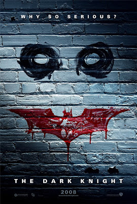
Although I don't have a website to help with my marketing campaign, I do have a promotional poster. It contains some of the contents from my film and the tagline. 'The Dark Knight' has many posters to promote the film but the first one that was released was in early December 2007. It doesn't really contain footage from the film but still allows itself to be identifiable with the movie and the audience. The poster image relates to the face of 'The Joker' who is the villain in the movie. Plus the audience will be able to make the connection with the marketing usage from the website and the poster. One of the taglines 'Why So Serious?' used on the website is also what is placed on the promo poster.

With this in mind, I've decided to release my promotional poster before anything else. Possibly 6/7 moths before the release date of the magazine cover. This will help to establish the movie towards the audience. The tagline on the promotional poster is there so it can be used as a way of engaging the audience with the idea of the movie.

After the promotional poster is out I would release the teaser trailer soon after so the audience can still be engaged with the film before it is even in theaters. In order to help sustain the established audience, a certain trademark would be the white masked people and the bloodied apples which are seen in the promo poster and throughout the teaser trailer. Also the tagline used in the promo poster is also used in the teaser trailer so the connection between the two products are strong.
In order to create maximum impact for my marketing campaign, my magazine cover on the issue of Sight and Sound will be released in October as part of a Halloween special edition so the audience can be hooked on the film about a month before it's release. Once again there is a connection between the three products. The white masked people are seen throughout all three of the marketing strategies.

When Heath Ledger (The Joker) died, in January 2008, Warner Bros had the promotional focus on the Joker from the film. They used an event to for there promotional advantage.
Even though its not the same concept I used the fact that a number of films that could be related to mine are released around the same time together and that could be when I release my promo poster and teaser trailer. Red Riding Hood, Beastly and Hoodwinked Too! Hood vs Evil are all films that are based upon fairy tales. If I release the two of my products around the dates that these films are released, it may put people who the state of mind for fairytale inspired films. Especially with Red Riding Hood as it relates more to my target audience.

As it is an independent film it won't be released through a theatrical way. Like most low budgeted independent movies, it will released through film festivals such as Dead by Dawn or FilmFest which focuses on showing horror movies.

Target Audience

An important aspect of following the brief specification for my project is to know who my target audience is for the film where I would be producing a teaser trailer, promotional poster and magazine cover. From the research that I have gathered it is known that the horror genre is mainly targeted at the age range of 14 to 24 year olds as it is what attracts them most.

I certainly do think that my film attracts the age range of the target audience. The main reason is because the main character is with in the age range of who my target audience are. In terms of gender I think that the film would be more aimed at females. The main character is female and the concept is based on the fairy tale snow white which is mostly loved by the female gender. Having noted this my film may attract more of a wider range of audience because Snow White has been around for so long and it is loved by both the old and young. When the people are acknowledged that it is based on snow white they may be attracted to see how there childhood film is interpreted.

A way to attract more audience is to advertise my film through a magazine. I have chosen Sight and Sound magazine for my film to be on the cover of one of it's issues. Sight and Sound is a British film magazine which reviews artistic, independent films as well as mainstream ones.
The main audience for this magazine are most likely to be aimed at an older age over 35 years and people with a high intelligence and social class. Mainly middle class males.

This may be the opposite of who my target audience are, and this may be seen as a negative move. However in a positive way it works in my favor as I'm expanding the range of the target audience for my film. Plus it does contain artistic and intelligent contact as it Snow white is based on the original tale by the Grimm brothers and so is my movie.

Magazine Cover Analysis of Sight and Sound


Magazine cover analysis (Please Use Full Screen)


Sunday, 27 March 2011

Textural and Content analysis of “Sight and Sound” magazine.


As I have chosen Sight and Sound to promote my film I have chosen one of their magazines to analyse in preparation for when I create my own. Usually Sight and Sound magazine covers are kept simple and they don’t come across as bold.


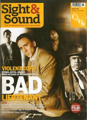
This issue is from June 2010. At the time it was promoting the film ‘Bad Lieutenant: Port of Call New Orleans. The film titles first word is in much larger text as it wants to garb the reader’s attention by using a short but loud technique. We as the audience are mostly attracted to the actor Nicholas Cage. This is because there is more light focused on him suggesting that he is the main character of the film.

There are other people on the front cover but as they are not in the foreground we rarely focus on them. On the right of Nicholas Cage there is an overweight man in the background. The colour tone is different. It is more black and white/sepia. This man and two others in the background don’t seem to be together with Nicholas Cage. This meaning that the people on the cover have been photo shopped in. This gives us more of an element of the film it’s promoting and the characters in it. We know that Nicholas Cage is the main character and the guy on his right has something to do with him. There is text on the front cover that states four actors’ names. The majority of the audience may not know who the other three guys our as they may not be that popular/mainstream so it was wise to put Nicholas Cage with more focus as it helps promotes the magazine and the film.


This magazine cover doesn’t carry a lot of information on it other than the title of the film and one or two things about it. Underneath the film title there is more text in smaller font. It advertises two features that are contained within the magazine. They are features on the media rather than about celebrities, compared to other film magazine cover ‘Total Film’. One of the features ‘The New Golden Age of British TV Drama Chris Morris ‘ Four Lions’’ elevates the fact that this is a British film Magazine that focus’s mostly on the intellect and artistic fleur of films rather than what was produced from Hollywood budget.


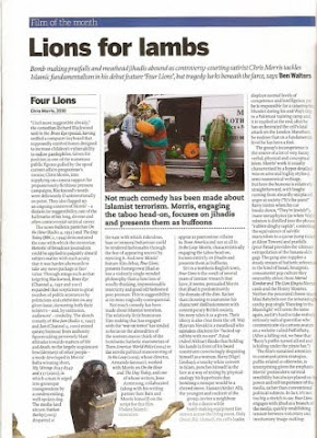
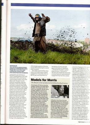
I looked at this article feature from the magazine which is titled ‘Lions for lambs’. This review focuses more on the director’s point more than the actual film. However it does look at various aspects of the film such as the comedy input of the film. Mostly after something has been stated about the film, the article makes a lot of references to other projects that relates to the director. For example, ‘Not much comedy has been made about Islamist terrorism. The relatively little humorous film-making that has engaged with the ‘war on terror’ has tended to focus on the absurdities of the western stance: think of the bombastic – bathetic marionettes of Team America: World Police (2004) or the servile political manoeuvring of In the Loop (2009), whose director, Armando Iannucci, worked with Morris on On the Hour and The Day Today, and one of whose writers, Jesse Armstrong, collaborated (along with his writing partner Sam Bain and Morris himself) on the script for this film.’


There are more examples like this through the rest of the article. There is no negative or positive approach to how good the film is; the reviewer just states how the film conveys and how the director conveyed it. In most film articles there would be expectancy of information or talk about the characters from the film. But as this is a British New Age film it is based on reasons of the film and the main concept.


The context of this magazine is consists of reviews and articles of films plus other media relations i.e. DVDs and books. As well as reviewing the listed films, they also add in the credits of it. They acknowledge the people who actually made the movie. It is less featured on celebrities and other context that could be classified as being vague when considering this type of magazine. Even the advertisements fit directly in with the magazine, 15.38% of the context is advertisements. Empire magazine advertises games, DVDs, movies, and some clothing items. However the little percentage of Sight and Sound consists of films, DVDs, film festivals, institutions where one could study film plus there is also an advertisement that promotes ‘LastExitToNowhere.com’ which sells t-shirts, hooded tops, posters etc the factor is that they are logoed with relation to films.


This certain issue, I would say, is mainly aimed at the male gender. The front cover has the film that they are promoting and it only shows men. Nicolas Cage is mostly known for action films (which targets mainly males). The colour scheme, as well, does not scream out for females to pick up the magazine as the colours are dull. Also the majority of films featured in this magazine are mainly male dominated.

Thursday, 24 March 2011

Promotional Poster Analysis of Victoria Lake


Promotional Poster Analysis (Please Use Full Screen)


The Promotional Poster of my film was fun but long to create as I tried a number of different ways on how it should come across. For certain there were key things that had to be within the poster such as a references to the teaser trailer and it needed to follow the characteristics of a horror promotional poster from the research I gathered. Overall I do think that my promotional poster works well and I think it will appeal to the audience. Unfortunately there is a mistake on the poster that is too late to correct. It happens to be the spelling typo on the tagline. Instead of it saying 'Fairy Tale' it says 'FairyTail'. It is kind of a downfall as it takes away the professional approach of my creation.


Sunday, 20 March 2011

Analysis of Red Riding Hood Promotional Poster


As the previous promotional poster I looked at was only for television release I decided to go in search for a promo poster for theatrical release that relates to my teaser trailer production.

The poster on my left is promoting a film with a similar concept to mine. It is based on the fairy tale of ’Little Red Riding Hood’ but also with a thriller genre. Even though it is not horror it still portrays some of the conventions such as the fact that it is a dark and mysterious production. Plus it is relevant to my film as it is based on a childhood fairytale but with a horror twist.
Although the genre is thrill the promotional poster still carries conventions that I could possibly use for my design.

Like ’Snow White: A Tale Of Terror’ the main colours featured in this poster are black, red and white/grey. Also like that poster, what sticks out mainly for me is the red image in the centre of the poster. The image is of what might be red riding hood, as the hood itself makes the face of the person become unable to be seen. This speculates mystery, mystery can sometimes evolve into fear. It is perhaps what the developers of the poster are trying to convey. The title of the film is also in red. Like the image of red riding hood, the colour is vibrant and stands out. Plus it looks like the title is meant to convey blood as there is some splatter on the title.

From looking at both posters I would say that it is important to include a tagline on mine. This posters tagline is ’believe the legend, beware the wolf ’. It’s short but abrupt as it makes a statement that is easy t remember. It is also used in the films trailer. Once again it lets the audience identify with the link between the two media texts.

The background of this promotional poster is what I’ve had in mind for my production of my poster. It’s of trees in a forest at night. The usage of this is very effective as it brings across a dark, eerie, mysterious feel to the poster. Plus the image of the trees also includes an aspect of coldness in the air which can be linked onto death. Also as a dark background image, it makes the vibrant colour of the red cloak/hood stand out to catch the viewers eye even more.
At the bottom of the poster the release date is stated. It is small but still noticeable as it is in white font which also stands out from the dark background.

Apart from the tagline, which is white as well, above that is small white text which reads ‘ from the directors of Twilight’. this may help with the marketing and viewing ratings of release of the film as ‘Twilight’ is such a big hit amongst the audience.

Overall this poster generates more inspiration for my creation of my promotional poster. It may not be of horror genre but it still has beneficial and relevant use of knowledge and information for portraying the conventions of horror for the production and finish element of my promotional poster.

Thursday, 17 March 2011

Analysis of Snow White: A Tale of Terror Promotional Poster


As the trailer that I looked at as part of my research was Snow White: A Tale of Terror, it is only right that I look at the promotional poster of it as well. As this film was aired only through TV release the promotional poster will carry different conventions of what a promotional poster for a film released in theatres would have.

However this promotional poster does hold key characteristics of its genre which also which happens to be the same as mine, fairytale/horror. One key aspect of this poster that stands out for me is the bleeding red apple. Against the black and white of the rest of the poster the vibrant colour immediately stands out. It is significant because the film is based on snow white which has a trademark of apples. This is relevant to my project as a key feature in my teaser trailer is a blooded apple and I hoe to interpret it into my promotional poster.

Also what else that stands out in this promo poster is the shard of mirror glass in the top of the apple. It is as if to say that it is the glass what’s making the apple bleed. It also refers back to the trailer as we see it being in it. This gives awareness to the audience as they can make the link between the two and know more about the basis of the film. Plus the image of the glass in the bleeding apple relates to the tagline featured on the poster. ‘the fairy tale is over’. This could mean that the apple represents the fairy tale and the glass is the cause of its death.

Apples do have a very strong significance and can be referred to many things. When seeing this on the poster people automatically think of the fairy tale snow white and how it killed her. This is an important reference because it signifies the innocence of the fairy tale and the danger of how it killed her. Also the fact that what was led to the death of snow white is the temptation of the apple. The apple acted as a tool of temptation to get Snow to take a bite of the apple. Like the poster is doing to us, it uses the apple to draw as in as it is what stands out the most.

Again when people think of apples they may think of the biblical story of Adam and Eve. Eve was tricked by the snake to take an apple from the forbidden tree. This led to the judgement of God upon them and punishment throughout mankind. The apple is certainly a sign of temptation and innocence.

Above all this there is three images of the main characters of the film. The stepmother is pictured in the mirror glass shard looking quite sinister. It is possible that this signifies that she is the evil one that kills the fairytale.

All the images are in black, white and red. Typical conventions of a horror movie poster.
Even though it is not entirely relevant to the brief of my project it does contain characteristics that inspire me for creating my promotional poster for my film/teaser trailer.

Tuesday, 15 March 2011

Questionnaire on Teaser Trailer Victoria Lake

1) Please state your age


2) Please state your gender


3) How does the first set of music set the scene?


How does it fit in with the rest of the trailer?


4) How effective is the text between shots?


Do they need to be held for longer or shorter?


Is/ how is it necessary for this teaser trailer?


5) What do the shots of the apples signify to you?


6) Even though it is shot in daylight. How well does it convey the genre of horror? Please state key aspects


7) How does the change in music benefit the trailer?


8) How well is the main character as a convincing terrified victim?


9) Is the shot of the cutting of the hand convincing enough and how would you describe it. What does it add or take away from the trailer?


10) What do you feel from the shots of the people in white masks? What impression do they give you?


How do they live up to the conventions of a horror trailer?


Please give an example of specific shots that stand out in the teaser trailer in terms of conveying a horror teaser trailer.


Please state what could be improved or changed in this trailer.

Saturday, 12 March 2011

Analysis of Story board

When if first designed the scenes on a storyboard for my teaser trailer I hoped that when I filmed it would turn out in the exact same way. However as the production went on I realised that not everything could go to plan. Due to the facts of the weather, daylight, timing props, accessibility (settings) and the amount of people my trailer still has some scenes from the storyboard but it has changed. There are some shots that I followed through with but I didn’t add them in my trailer because it didn’t cooperate well. For example in the early scenes of ‘Victoria talking and being mocked by her friends’ I decided to leave it out as it took up too much time and didn’t work with the rest of the trailer of conveying horror. Also as I was unable to access a real looking axe I chose to abandon the drawn scene and leave it out of the trailer. I did hope to shoot my film at night but due to less film equipment and inconvenience it failed to happen. On the contrary I did manage to get my kidnappers to my liken.

Thursday, 10 March 2011

Analysis of Teaser Trailer: Victoria Lake

The teaser trailer that I have created is based on a modern day snow white fairy tale but with a horror genre based modern twist. As my film distributor is Focus Features I have placed that as my opening shot of the trailer. I also had intensions to place the momentum pictures logo (afterwards as they are the UK distributor) but there were technical difficulties with trying to get the right size of the image.

As I started earlier, my film is based on snow white so when I filmed my trailer, one of the props I used was fake blood on a red apple. I decided by putting this at the start of my teaser trailer as it will quickly establish to the viewers that it is a horror trailer due to the blood, plus I added a ‘bleach bypass’ effect onto the clip so it made the shot of the apple look more dark and chilling.

As well as this happening there is backing music to the which starts from the very beginning of the trailer and lasts for 20 seconds. It is called ’Rio Vista’ which I downloaded from freeplay music. It consists of strings and piano instruments which weave a contemplative melody, slowly turning and eventually closing with a slight hint of better days to come. This fits in well for the first part of my teaser trailer as it is slow but dramatic. It sets the placing of the trailer and allows the views to take in the innocence because the music allow them to suspect a downfall change.

When I looked at the trailer of another film (Snow White: A Tale of Terror). It was shown in the near start, black screens with text then a shot from the film then a black screen with different text and so on. They did this so they can put it across to the audience and get them in the right frame of mind set. It was more effective then having a voice over as the font that they used was quite like old fashion fairy tale writing. So using this technique is what I did. I added text on black screens between high angel shots of the main girl walking through a car park. From the way the girl is acting it seems as if someone is watching her. Perhaps the audience would feel its them because of the way the camera is angled.

The first set of text is ‘If you’ve ever dreamed’ in a Trajan pro white font, size 43. I chose this because it felt a bit fairy tale like but a bit modernised, plus it fits well when I used the font for my promotional poster and magazine cover. The second screen of text is in the same way but reads ‘of living happily ever after. By now, most of the viewers would know where the next sentence is leading. They will probably have a suspicion that it is based on a fairytale. This is good because they know basic information but they do not know the full details. It conveys what a teaser trailer is supposed to do. Plus it also teases them at this point because they don’t know the rest of the sentence, so want to find out.

There is another screen of text before the sentence ends which reads ‘then dream…’ the dot, dot, dot leaves for a dramatic pause which creates suspicion for the audience. This is where another piece of music starts to play for 5.1 second. It is called ’designer synth’ which I retrieved from the imovie sound effects. It plays through the last clip of the girl walking through the car park and then onto the last bit of text (for the time being) which reads ’again’. There is also a thunder clap sound effect from the life sound effects which lasts for 4.2 seconds.

After that the next shot is of three people in white masks with their hoods up. This is where the ’deep noise’ sound comes in (34 seconds). I downloaded this from Royalty free music which was made by Kevin Maclead. ‘Deep Noise’ is a strong, deep wind howling sound effect. I have used this mostly straight through the rest of the trailer along with ’The House of Leave’ (39 seconds) also by Kevin Maclead from Royalty free music. The instruments used are violins, synth, percussions and the harp. It is sort of a simple heart refrain that plays with a child’s melody, but is torn apart by discordant screeching noises, thumps, growls, and technical noises. It is dark and eerie as well as unnerving.

The mid shot is off the masked hooded people (MHP) standing in the middle of the woods and the camera is slightly panning to the left. It then cuts to the close up panning shot of the girl from earlier. She is meant to be frightened as she searches around her. The next following shots are taken in turns from the girl and the MHP. This is another idea I got from the trailer I looked at. They did this between the stepmother and snow white (looking between good and evil). The audience would see innocence then malevolence, etc which will lead them to suspect that there is a strong link between the two as they are both in the same woods, so the MHP might catch up with her soon.

In one of these shots, there is a mid shot of the MHP slowly walking (a convention of horror - villains walk slowly) towards the camera- which is the viewers. When you watch it, it makes you feel there coming towards you- the audience. One particular shot that I think stands out the most is the low angle shot of one of the MHP is up in the tree. It adds to the creepy effect of the horror trailer and it looks like its looking and waiting at the viewers ready to attack.

After that I added 3 seconds of a red ribbon tangled in a tree. The colour signifies blood and danger, while the ribbon itself signifies youth and innocence which relates to the victim girl. Being tangled in the tree represents the girl being in danger an unable to escape. Ironically the next shot is of the girl running frightenly through trees and branches. When I edited this clip I slowed down the speed of it so it gives more suspense and intensity as it comes across, to the viewers, as if she is running out of time. Quickly soon after there is a close up of the bloodied apple. I placed that there as a reminder of its significance.

As we see her running again and then towards us. Again I used the slow motion edit on the clip so when she turns towards the camera we get the full effect of her looking shocked. Before we see what she is looking at, there is a quick shaky panning shot of the bloodied apple. It is there because it is a kind of horrifying image in her head and as the viewers are to be in her mind set. We then get an over the shoulder shot from the girl and we see that she has collided with the MHP. The tall middle one places her left hand on the girls shoulder. As the hand is placed on the shoulder I added a 'dreadful short swoosh' sound effect to it as comes across as abrupt and overpowering (like the MHP).

There is one more shot of the apple. This time it is a high angle shot but more slower and steadier. This represents that (from the villains point of view) that there isn't need to panic as their job is in process (as the bloodied apple represents them). But from the victims point of view we see there is need to panic but is unable to because the villain is in control.

I added more text after that shot. It is the same format as before but this time it reads ' Fairytale'. It has 'dreadful short woosh' and 'thunder roll' sound effect. This adds to the effect that it's making a statement. The next two words of text are in the same format but reads 'Becomes' and 'Nightmare'. They both contain the same sound effects as 'Fairytale' and they also make a dramatic statement. Between these shots there is a continuation from where the MHP took hold of the girl. Its shot from the right of the MHP and now the rest have joined in to restrain the girl. The other shot is a close up of what seems to be the girls hand struggling as one of the MHP has and continuing to cut her wrist.

After the 'Nightmare ' there is a zoomed close up of a blood hand print on a tree. 'The House of Leaves' and 'Deep Noise' have ended as the film title comes up using the same format as the previous text 'Victoria Lake'. The audience can now identify who the girl is. There is also a 'thunder roll' as the title is played. After that there is a mid shot of the girl tied up by the wrists in the corner. I edited her screams by reversing her shot as it gave a more eiere chilling effect.

Another black screen has the same text format which reads 'Coming Soon' has also the same sound effect ' thunder roll' but this time it carries on to the final clip which is a close up of the MHP tilting there heads to the left. I used the 'Bleach Bypass' effect and slow motion on this shot so it is more contrasting and a darker heavier effect.

The teaser trailer ends with a black screen and a sound effect of 1.6 seconds of 'synth zap impact' from the ilife sound effects.


Saturday, 5 March 2011

Production of Teaser Trailer

The filming of my teaser trailer was both satisfying but yet frustrating. Before I could actually start filming I had to do quite a bit of organising such as finding the cast, arranging dates and time due to specification of weather issues, prop usage.

It didn’t go all to plan as I hoped it would be. It is not in the exact format of the storyboard but it does include the basic follow up of it. While filming I had to change some of the features that I planned out due to the fact that I couldn’t arrange for the right amount of cast and couldn’t get all the props necessary. Plus I wanted to set most of my teaser trailer at night but the cast I had weren’t able to make it for that time setting.

With finished filming, it was time to edit my teaser trailer. Even though filming didn’t go as well as planned I made do with what I had and tried to follow the storyboard as much as I could. Once again it didn't go to perfect order. Using imovie took a bit of time to get used it was a long time since I used the program and so had to regain some knowledge of it's uses. However I managed to get the hang of it and I was able to alter clips from the contrast, to the speed to the amount of usage I wanted involved.

As I had a lot of footage from filming I experimented with making the teaser trailer with different attempts of fitting together what worked best. Although some worked better in places then others, the completed version of my teaser trailer is what I’m happiest with the most. It is uploaded on to you tube and even though I had a lot of footage to work from, it all came together in the end.

Amongst the filming of my teaser trailer, there were some shots that took some time to develop which had to involve a number of retakes. It took some time to get right but there was a light hearted feel about it between me and the cast.